Experience Cloud (LWR) サイトにおいて、ブランドカラーに合わせた「ダークモード」や「テーマ切り替え」の実装は、UX向上のための重要な要件です。しかし、色設定やフォント設定など、管理項目が増えれば増えるほど、標準のプロパティパネルでは設定しきれなくなります。
Spring ’26 (API 66.0) で正式リリース(GA)となる ExperiencePropertyTypeBundle を使用すれば、複雑な設定項目を「構造化データ」として定義し、アコーディオンやタブを用いたリッチな設定画面を、驚くほど少ないコード量で実装できます。
ExperiencePropertyTypeBundle の基本について知りたい方は、以下の投稿をご覧ください。
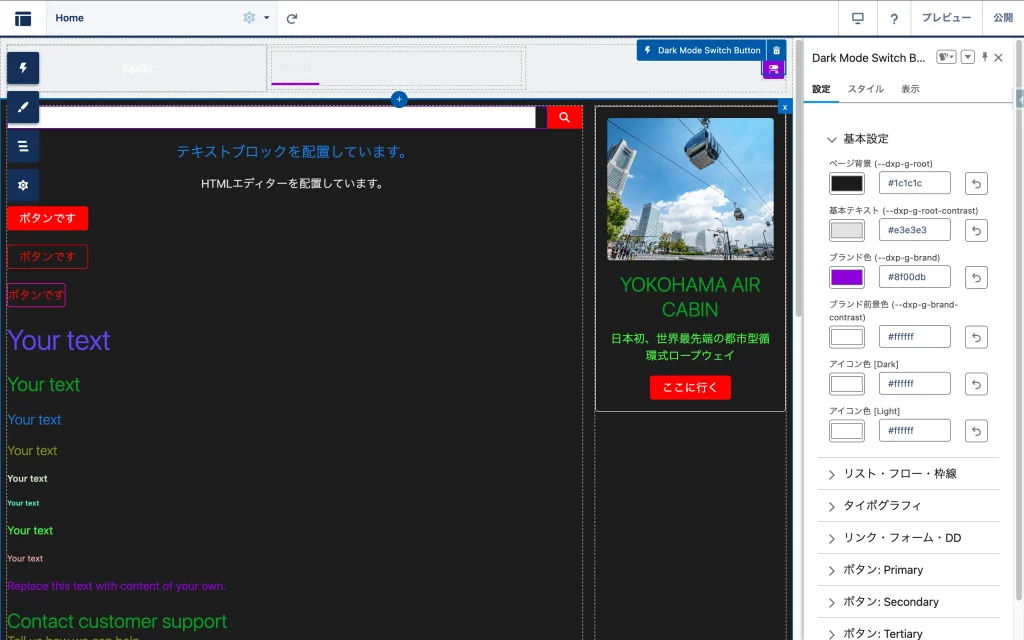
今回は、全ページの色設定を一括管理する「Dark Mode Switch Button」の作成を通して、この最新メタデータの活用方法をハンズオン形式で解説します。
今回の記事で作成したコンポーネントの全ソースコードをGitHubで公開しています。 ぜひ Clone して、あなたの組織で動かしてみてください。
作成するコンポーネントの構成
今回作成するのは、以下の3つの要素です。以前の手法(CPE)で必要だった「設定画面用の親LWC(Configurator)」は不要になります。
- ExperiencePropertyTypeBundle: 設定データの「型」と「画面レイアウト」を定義。
- Color Picker LWC: 色を選択するための部品(プロパティエディタ)。
- Main LWC: サイト上に配置され、CSS変数を書き換える本体。
ディレクトリ構成
force-app/main/default/
 ├── experiencePropertyTypeBundles/
 │   └── themeSettingsType/       <-- 設定の「型」と「レイアウト」定義
 │       ├── schema.json
 │       └── design.json
 ├── lwc/
 │   ├── removableColorPicker/    <-- カラーピッカー(部品)
 │   │   ├── removableColorPicker.html
 │   │   ├── removableColorPicker.js
 │   │   └── removableColorPicker.js-meta.xml
 │   └── darkModeSwitchButton/.   <-- 画面に表示するLWC本体
 │       ├── darkModeSwitchButton.html
 │       ├── darkModeSwitchButton.js
 │       ├── darkModeSwitchButton.css
 │       └── darkModeSwitchButton.js-meta.xml
ステップ1:設定データの「型」を定義する (schema.json)
まずは、テーマ設定として保存したいデータの構造を定義します。force-app/main/default/experiencePropertyTypeBundles/themeSettingsType フォルダを作成し、以下のファイルを作成します。
schema.json
ここでは、背景色やテキスト色、ボタンの色などを lightning__objectType として定義します。これがコンポーネントに渡されるデータの「正解」となります。
{
    "title": "Theme Settings Configuration",
    "description": "Configuration object for site colors and styles",
    "lightning:type": "lightning__objectType",
    "properties": {
        "colorRoot": { "lightning:type": "lightning__textType", "title": "ページ背景 (--dxp-g-root)" },
        "colorText": { "lightning:type": "lightning__textType", "title": "基本テキスト (--dxp-g-root-contrast)" },
        "colorBrand": { "lightning:type": "lightning__textType", "title": "ブランド色 (--dxp-g-brand)" },
        "colorBrandContrast": { "lightning:type": "lightning__textType", "title": "ブランド前景色 (--dxp-g-brand-contrast)" },
        "iconColorForeground": { "lightning:type": "lightning__textType", "title": "アイコン色 [Dark]" },
        "iconColorForegroundLight": { "lightning:type": "lightning__textType", "title": "アイコン色 [Light]" },
...
※ 実際には必要な項目数だけプロパティを追加します。
ステップ2:設定画面のレイアウトを定義する (design.json)
次に、Experience Builder上の設定パネルの見た目を定義します。ここが ExperiencePropertyTypeBundle の強力な点です。LWCでHTMLを書くことなく、lightning/accordionLayout を指定するだけで、整理された設定画面が構築できます。
design.json
各プロパティに対して、後述するカスタムエディタ c/removableColorPicker を割り当てます。
{
    "propertySheet": {
        "view": {
            "definition": "lightning/accordionLayout",
            "children": [
                {
                    "definition": "lightning/accordionSectionLayout",
                    "attributes": { "label": "基本設定" },
                    "children": [
                        { "definition": "lightning/propertyLayout", "attributes": { "property": "colorRoot" } },
                        { "definition": "lightning/propertyLayout", "attributes": { "property": "colorText" } },
                        { "definition": "lightning/propertyLayout", "attributes": { "property": "colorBrand" } },
                        { "definition": "lightning/propertyLayout", "attributes": { "property": "colorBrandContrast" } },
                        { "definition": "lightning/propertyLayout", "attributes": { "property": "iconColorForeground" } },
                        { "definition": "lightning/propertyLayout", "attributes": { "property": "iconColorForegroundLight" } }
                    ]
                },
...
            ]
        },
        "propertyRenderers": {
            "colorRoot": { "definition": "c/removableColorPicker" },
            "colorText": { "definition": "c/removableColorPicker" },
            "colorBrand": { "definition": "c/removableColorPicker" },
            "colorBrandContrast": { "definition": "c/removableColorPicker" },
            "iconColorForeground": { "definition": "c/removableColorPicker" },
            "iconColorForegroundLight": { "definition": "c/removableColorPicker" },
...
※ 実際には必要な項目数だけプロパティを追加します。
ステップ3:入力部品(カラーピッカー)を作成する
設定画面で使う「値を削除できるカラーピッカー」を作成します。 このコンポーネントは lightning__PropertyEditor ターゲットを持つ必要があります。
removableColorPicker.js-meta.xml
<?xml version="1.0" encoding="UTF-8"?>
<LightningComponentBundle xmlns="http://soap.sforce.com/2006/04/metadata">
    <apiVersion>66.0</apiVersion>
    <isExposed>true</isExposed>
    <masterLabel>Removable Color Picker</masterLabel>
    <targets>
        <target>lightning__PropertyEditor</target>
    </targets>
</LightningComponentBundle>
removableColorPicker.html
標準のカラー入力と、値をクリアするボタンを配置します。
<template>
    <div class="slds-form-element slds-m-bottom_x-small">
        <label class="slds-form-element__label">{label}</label>
        <div class="slds-form-element__control">
            <div class="slds-grid slds-gutters_x-small slds-grid_vertical-align-center">
                <div class="slds-col slds-grow-none">
                    <input
                        type="color"
                        class="slds-input slds-p-around_none"
                        style="height: 32px; width: 50px;"
                        value={pickerValue}
                        onchange={handleChange}>
                </div>
                <div class="slds-col slds-grow">
                    <lightning-input
                        type="text"
                        variant="label-hidden"
                        value={pickerValue}
                        pattern="^#([A-Fa-f0-9]{6}|[A-Fa-f0-9]{3})$"
                        onchange={handleChange}
                        placeholder="#RRGGBB">
                    </lightning-input>
                </div>

                <template if:true={hasValue}>
                    <div class="slds-col slds-grow-none">
                        <lightning-button-icon
                            icon-name="utility:undo"
                            variant="border-filled"
                            alternative-text="リセット"
                            title="設定を解除"
                            onclick={handleClear}>
                        </lightning-button-icon>
                    </div>
                </template>
            </div>

            <template if:false={hasValue}>
                <div class="slds-form-element__help">未設定 (デフォルト適用)</div>
            </template>
        </div>
    </div>
</template>
removableColorPicker.js
エクスペリエンスビルダーとの通信には valuechange イベントを使用します。
import { LightningElement, api } from 'lwc';

export default class RemovableColorPicker extends LightningElement {
    @api label;
    @api value;

    /**
     * 値が設定されているか(バッジ表示用)
     * null, undefined, 空文字以外なら true
     */
    get hasValue() {
        return this.value != null && this.value !== '';
    }

    /**
     * カラーピッカーに渡す値
     * 余計なデフォルト値を設定せず、nullならnullを渡します。
     * (lightning-input type="color" は null を受け取るとブラウザ標準の色を表示しますが、
     * hasValueがfalseなので「デフォルト」バッジが表示され、区別がつきます)
     */
    get pickerValue() {
        return this.value;
    }

    handleChange(event) {
        // 値が空文字の場合は null として扱う
        const val = event.target.value;
        this.dispatchChange(val === '' ? null : val);
    }

    handleClear() {
        this.dispatchChange(null);
    }

    dispatchChange(val) {
        // 標準仕様: 'valuechange' イベントで { value: newValue } を送る
        this.dispatchEvent(new CustomEvent('valuechange', {
            bubbles: true,
            composed: true,
            detail: { value: val }
        }));
    }
}
ステップ4:テーマ切り替え本体を作成する
最後に、サイト利用者が触れるスイッチ本体 c-dark-mode-switch-button を作成します。
darkModeSwitchButton.js-meta.xml
ここで、ステップ1で作成したカスタム型 c__themeSettingsType を指定します。
<?xml version="1.0" encoding="UTF-8"?>
<LightningComponentBundle xmlns="http://soap.sforce.com/2006/04/metadata">
    <apiVersion>66.0</apiVersion>
    <isExposed>true</isExposed>
    <masterLabel>Dark Mode Switch Button</masterLabel>
    <targets>
        <target>lightningCommunity__Page</target>
        <target>lightningCommunity__Default</target>
    </targets>
    <targetConfigs>
        <targetConfig targets="lightningCommunity__Default">
            <property
                name="themeSettings"
                type="c__themeSettingsType"
                label="テーマ設定"
            />
        </targetConfig>
    </targetConfigs>
</LightningComponentBundle>
darkModeSwitchButton.js
渡された themeSettings オブジェクトを読み取り、CSS変数を適用します。
import { LightningElement, api } from 'lwc';

export default class DarkModeSwitchButton extends LightningElement {
    // 内部保持用の変数
    _themeSettings;

    @api
    get themeSettings() {
        return this._themeSettings;
    }

    set themeSettings(value) {
        this._themeSettings = value;

        // Settingが更新された際、まだ初期化前(isDark=false)でも
        // 本来ダークモードであるべきなら適用してあげる必要がある
        if (!this.isDark) {
            this.initializeDarkMode();
        }

        // 値が変更されたタイミングでテーマを再適用
        if (this.isDark) {
            this.applyTheme();
        }
    }

    isDark = false;

    connectedCallback() {
        this.initializeDarkMode();
        if (this.isDark) {
            this.applyTheme();
        }
    }

    initializeDarkMode() {
        // localStorage または OS設定の確認
        const savedTheme = localStorage.getItem('siteTheme');
        if (savedTheme === 'dark' || (!savedTheme && window.matchMedia('(prefers-color-scheme: dark)').matches)) {
            this.isDark = true;
        }
    }

    handleToggleClick() {
        this.isDark = !this.isDark;
        this.applyTheme();
        localStorage.setItem('siteTheme', this.isDark ? 'dark' : 'light');
    }

    applyTheme() {
        const style = document.documentElement.style;
        // Getter経由で取得、なければ空オブジェクト
        let settings = this.themeSettings || {};

        if (typeof settings === 'string') {
            try {
                settings = JSON.parse(settings);
            } catch (e) {
                console.error('JSON Parse Error', e);
                settings = {};
            }
        }

        const darkVars = this.getCssVariableMap(settings);
        const darkKeys = Object.keys(darkVars);

        if (this.isDark) {
            // === ダークモード適用 ===
            darkKeys.forEach(key => {
                const val = darkVars[key];
                if (val) {
                    style.setProperty(key, val);
                } else {
                    style.removeProperty(key);
                }
            });
            this.injectOverrideStyles(settings);
        } else {
            // === ダークモード解除 ===
            darkKeys.forEach(key => {
                style.removeProperty(key);
            });

            // ライトモード変数の適用 (iconColorForegroundLightなど)
            const lightVars = this.getLightModeVars(settings);
            Object.keys(lightVars).forEach(key => {
                const val = lightVars[key];
                if (val) {
                    style.setProperty(key, val);
                } else {
                    style.removeProperty(key);
                }
            });

            // ライトモード変数の復元や強制スタイルの削除処理
            const overrideStyle = document.getElementById('dxforce-style-overrides');
            if (overrideStyle) overrideStyle.remove();
        }
    }

    getLightModeVars(s) {
        const val = s.iconColorForegroundLight;
        return {
            '--slds-c-icon-color-foreground': val,
            '--slds-c-icon-color-foreground-default': val,
            '--dxp-g-neutral-3': val
        };
    }

    // 設定オブジェクトのキーとCSS変数のマッピング
    getCssVariableMap(s) {
        return {
            // --- 基本 ---
            '--dxp-g-root': s.colorRoot,
            '--dxp-g-root-contrast': s.colorText,
            '--dxp-g-brand': s.colorBrand,
            '--dxp-g-brand-contrast': s.colorBrandContrast,
            '--slds-c-icon-color-foreground': s.iconColorForeground,
            '--slds-c-icon-color-foreground-default': s.iconColorForeground,
            '--dxp-g-neutral-3': s.iconColorForeground,

            // 以下省略(実装はGitHubをご覧ください)
        };
    }

    // CSS変数でカバーできない箇所の強制上書き
    injectOverrideStyles(s) {
        const existing = document.getElementById('dxforce-style-overrides');
        if (existing) existing.remove();

        const cssRules = [];
        if (s.formBg) {
            cssRules.push(`input { background-color: var(--dxp-s-form-element-color-background) !important; }`);
        }
        if (s.recListHeaderBg) {
            cssRules.push(`
                .record-list-table-wrapper, .forceListViewManagerHeader {
                    background-color: var(--dxp-c-record-list-column-header-background-color) !important;
                    --dxp-c-record-list-column-header-background-color: ${s.recListHeaderBg} !important;
                }
            `);
        }
        if (s.recListRowHoverColor) {
            cssRules.push(`
                tr:hover > td, tr:hover > th, .slds-table tbody tr:hover > td, .slds-table tbody tr:hover > th {
                    background-color: ${s.recListRowHoverColor} !important;
                    --dxp-c-record-list-table-row-hover-color: ${s.recListRowHoverColor} !important;
                }
            `);
        }
        if (s.colorRoot) {
            cssRules.push(`
                html, body {
                    background-color: var(--dxp-g-root) !important;
                }
                body { min-height: 100vh !important; }
            `);
        }

        if (cssRules.length > 0) {
            const styleTag = document.createElement('style');
            styleTag.id = 'dxforce-style-overrides';
            styleTag.textContent = cssRules.join('\n');
            document.head.appendChild(styleTag);
        }
    }
}
まとめ
ExperiencePropertyTypeBundleを採用することで、以下のようなメリットが得られました。
- UI構築の自動化: 最大のメリットはここにあります。アコーディオンやタブといった複雑なレイアウトを LWC の HTML/CSS で自作する必要がなくなり、
design.jsonだけで完結できました。 - データ構造の明文化: 巨大な JSON 文字列をブラックボックスとして扱うのではなく、
schema.jsonによって設定項目が定義されるため、メンテナンス性が向上しました。
lightning__objectType は便利ですが、Builder からの入力値が特定の状況下で文字列として渡されるケースに備え、LWC 側で JSON.parse をフェイルセーフとして実装に残す判断をしました。「完全にパース不要」という理想よりも、「どんな状況でも壊れない」という堅牢性を優先した結果、完成度の高いコンポーネントとなりました。
Spring ’26以降、LWRサイトでの高度なコンポーネント開発において、この手法は間違いなくスタンダードになります。ぜひあなたのプロジェクトでも導入してみてください。
参考URL
Salesforce Spring ’26 Release Notes

Custom Property Types and Property Editors
Metadata API Developer Guide: ExperiencePropertyTypeBundle


読者の声